
Selected design projects created in my roles at nonprofit and cultural organizations, where I led visual storytelling and campaign design.
Organizational Projects
Senior Multimedia Designer & Digital Operations Manager | National Medical Fellowships
2023–Present
Role: Senior Multimedia Designer & Digital Operations Manager
Focus: Institutional brand strategy, campaign systems, and digital infrastructure


Institutional Context
National Medical Fellowships is a national nonprofit advancing health equity by supporting underrepresented medical students and physicians through scholarship, leadership development, and workforce initiatives. The organization communicates across multiple audiences including scholars, alumni, donors, corporate partners, and healthcare institutions. Each requires clarity, credibility, and consistency. Within this environment, design functions as both communication and operational infrastructure.
My Role
As Senior Multimedia Designer & Digital Operations Manager, I lead the development and oversight of NMF’s visual communication systems while managing the digital processes that support them. My responsibilities extend beyond asset creation. I oversee brand consistency, establish scalable templates, manage cross-departmental design workflows, and ensure digital platforms operate cohesively and efficiently. I translate strategic organizational priorities into structured visual systems that function across print, digital, social, email, and event environments.
Strategic Pillars
Brand Stewardship: Protecting and evolving the organization’s visual identity across all departments. This includes typography, color systems, layout standards, and asset governance to ensure cohesion at scale.
Systems & Infrastructure: Designing templates, workflows, and digital frameworks that improve internal efficiency and reduce inconsistency. Strong systems allow teams to move faster without compromising brand integrity.
Information Architecture: Translating complex health equity narratives, institutional reporting, and donor communications into accessible visual hierarchies.
Cross-Platform Scalability: Developing asset families that operate seamlessly across digital campaigns, publications, presentations, and live events.
Cultural Literacy: Ensuring representation and tone reflect the communities NMF serves, maintaining visual dignity and authenticity.
Scope of Responsibility
Lead visual direction for institutional campaigns and communications
Establish and maintain brand standards across departments
Develop scalable templates for internal and external use
Oversee digital design workflows and production processes
Collaborate with leadership on strategic communications initiatives
Ensure consistency across web, social, print, and event environments
Impact
Increased cross-platform brand cohesion
Improved internal efficiency through structured templates and workflows
Clearer communication of complex health equity initiatives
Elevated donor-facing and partner-facing materials
Strengthened digital consistency across organizational channels
Reflection
Operating at the intersection of design and digital operations has reinforced my belief that institutional design must function as a system. Visual communication is most effective when supported by strong internal processes and scalable frameworks. My role bridges creative direction and operational execution, ensuring that strategy translates into cohesive, durable outcomes.
Institutional Brand Systems & Campaign Execution | Jazz St. Louis
2017–2020
Role: Sole In-House Designer
Focus: Brand implementation, campaign systems, and cross-platform marketing cohesion


Institutional Context
Jazz St. Louis is a nationally recognized arts organization presenting year-round performances, educational initiatives, and community programming. The institution engages diverse audiences including ticket buyers, donors, artists, students, and community partners.
The organization operates in a high-frequency promotional environment where clarity, consistency, and speed are critical. Within this setting, design functions as both cultural storytelling and marketing infrastructure.
My Role
As the Sole In-House Designer, I led all visual communication in partnership with the Marketing Director. I was responsible for expanding and operationalizing a newly introduced brand identity across every public-facing platform.
My role extended beyond individual asset creation. I translated brand standards into structured systems, developed repeatable campaign frameworks, and ensured consistency across a full performance season.
Strategic Focus
Brand Stewardship: Operationalized a refreshed logo into a cohesive visual system. Established standards for typography, layout architecture, and color application to ensure consistent brand execution across materials.
Campaign Systems: Developed scalable templates and grid frameworks to support recurring performances, season promotions, and educational programming without visual fragmentation.
Information Architecture: Structured complex event schedules into clear typographic hierarchies, prioritizing readability and audience navigation across posters, brochures, and digital campaigns.
Cross-Platform Alignment: Maintained cohesive design execution across print collateral, social media, email marketing, digital graphics, and in-venue materials.
Production Infrastructure: Managed high-volume deliverables under tight marketing timelines while maintaining brand integrity and quality control.
Scope of Responsibility
Lead visual execution for all institutional marketing materials
Implement and maintain brand standards
Develop scalable templates for recurring campaigns
Design and produce print and digital collateral
Collaborate with marketing leadership on promotional strategy
Ensure cohesive brand presence across all audience-facing environments
Impact
Strengthened brand consistency during a key identity transition
Improved clarity and organization in performance promotion
Increased internal efficiency through template-driven systems
Established a cohesive visual presence across the St. Louis arts community
Reflection
Operating as the sole designer within a performance-driven arts institution required systems thinking from the outset. Sustaining brand integrity across a full season of programming reinforced the importance of scalable frameworks and disciplined execution.
This role established my foundation in institutional brand management and campaign infrastructure.
Independent Commissions
Selected independent projects produced through : H.M Creative (Hevcasso Creations LLC) —
St. Louis County Flag Redesign
2025
Commissioned by: Kranzberg Arts Foundation
Collaborator: José Garza
Role: Co-Lead Designer


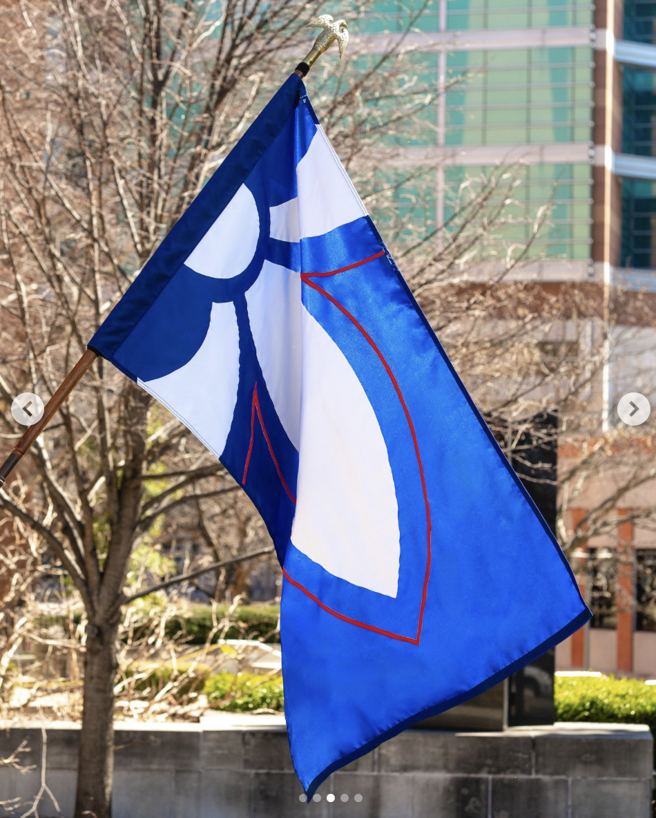
Project Overview
The redesign of the St. Louis County flag was a civic identity initiative aimed at replacing an outdated and largely unrecognized symbol with one rooted in clarity, community voice, and long-term relevance. This project required more than aesthetic refinement. It required public trust and cultural sensitivity.
The Challenge
The existing County flag lacked visibility and symbolic clarity. Many residents were unaware of it, and those who were found it visually complex and disconnected from contemporary identity.
The task was to create a design that:
Reflected regional heritage
Followed strong vexillological principles
Felt inclusive across diverse communities
Could endure for generations
Strategic Approach
Community Engagement: We hosted 3 small gatherings across the County to listen to residents’ perspectives on symbolism and identity. These conversations shaped the direction of the design.
Vexillological Discipline: We grounded the redesign in principles of simplicity, legibility, and meaningful symbolism to ensure scalability and longevity.
Future Orientation: Rather than centering nostalgia, the design emphasizes forward movement and unity. The fleur-de-lis is positioned to gesture toward collective progress.
Design Decisions:
Simplified composition for immediate recognition
Limited color palette for strong contrast and reproduction
Clear geometric balance for stability and motion
Directional symbolism reinforcing unity
Each decision was evaluated for both visual clarity and symbolic durability.
Impact
Increased public awareness of County identity
Community participation in a civic design process
A contemporary symbol positioned for long-term adoption
Reflection
This project reinforced my belief that design functions as cultural infrastructure. Civic symbols must be legible, inclusive, and built to last. That version is clean enough for a website while still communicating strategic depth.
Loretta Hall Park Banner
2025
Client: CDA Choice Neighborhoods
Location: St. Louis, Missouri
Role: Lead Designer
Scope: Environmental graphic, public installation

Project Overview
The Loretta Hall Park banner was created to mark space and mood within Downtown West. Installed along the streets surrounding the park, the banner acts as a visual signal that you have entered a distinct part of the city. Rather than relying on text-heavy messaging, the design communicates through bold shape, color, and symbolism.
Context
Downtown West sits between historic brick architecture and new development. It is a neighborhood shaped by transition. The banner needed to acknowledge that layered history while also suggesting forward movement. Because the banners are experienced outdoors and often in motion, the design had to be simple, striking, and legible from a distance.
The Core Idea
The composition centers around three primary elements:
The Arch
The sun
The eye
Together, they form a symbol of place, light, and perspective.
The Arch anchors the design in St. Louis. The rising sun suggests growth and optimism. The eye introduces a quiet layer of awareness and vision, hinting at a neighborhood that sees itself clearly and looks ahead.
Creative Approach
Bold Geometry
The design relies on clean, simplified forms. Large shapes ensure visibility at street scale and allow the banner to read instantly.
Color as Atmosphere
A warm gradient palette evokes sunset over the city skyline. The colors create warmth against brick facades and blue sky, shifting subtly throughout the day.
Vertical Emphasis
The composition follows the natural proportion of the banner format. The Arch rises, the sun radiates, and the eye grounds the lower half, creating balance within a tall, narrow space.
Minimal Text
The graphic carries the meaning. Typography is restrained so the symbol remains primary.
Installation
The banners were produced for outdoor durability and installed along primary corridors near Loretta Hall Park.
Considerations included:
Visibility from passing vehicles and pedestrians
Color integrity in changing light conditions
Cohesion when viewed as a series
When repeated along the street, the banners create rhythm and continuity.
Impact
Introduced a recognizable visual marker for Downtown West
Added warmth and vibrancy to the streetscape
Reinforced neighborhood identity through symbolic imagery
Contributed to a cohesive environmental presence around the park
Reflection
Environmental graphics are experienced differently than traditional design. They live in wind, sun, shadow, and movement. The Loretta Hall Park banner was an opportunity to distill St. Louis identity into a form that feels both rooted and optimistic. It is less about explanation and more about presence.
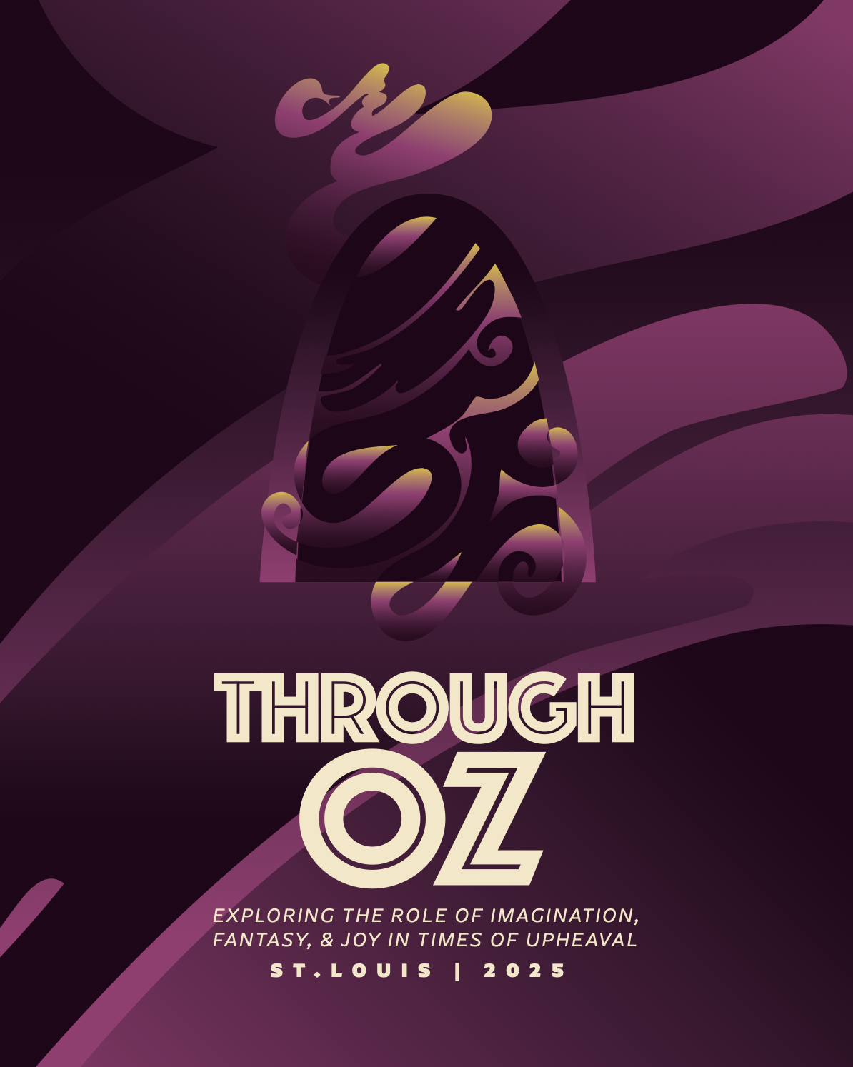
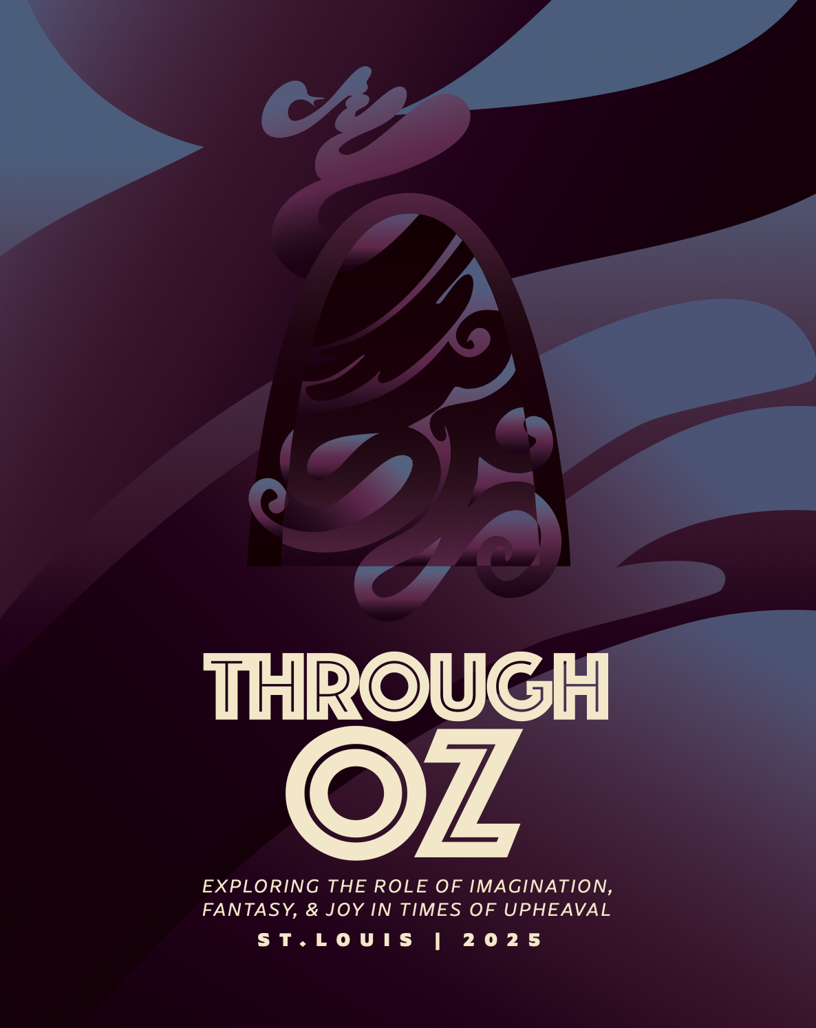
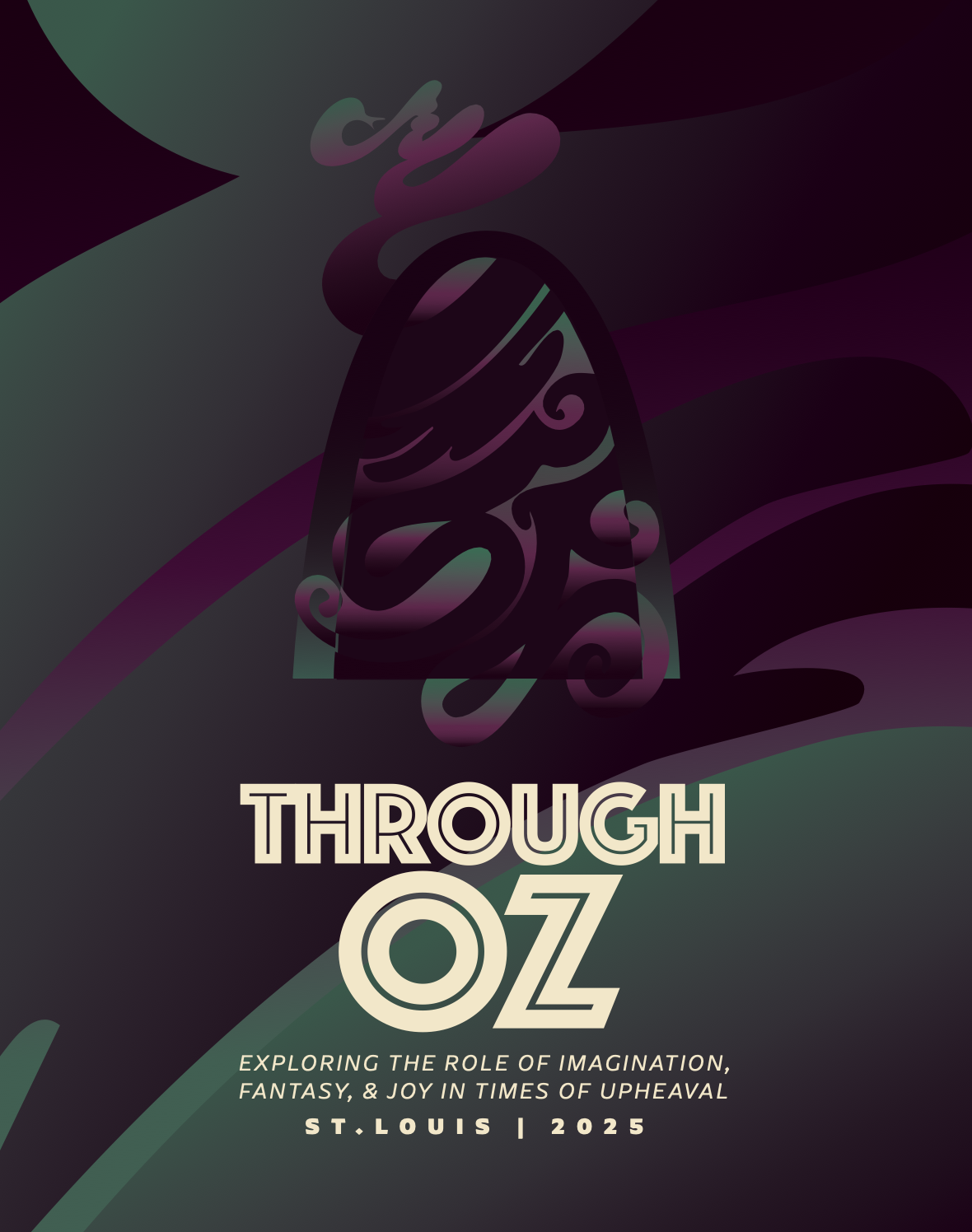
2025
Created within a one-week timeline, this poster required blending archival material with immediate local context. The project demonstrates creative agility under constraint while maintaining conceptual clarity.
The Through Oz poster was created for an exhibition developed in response to The Wiz being staged at the The Fabulous Fox Theatre. The exhibition used the show as a starting point to explore imagination and joy during difficult times.
A tornado had moved through St. Louis a few months before the exhibition opened. The curatorial team asked that I incorporate the original “Tornado Lady” illustration from The Wiz album artwork into the design.
Instead of placing the figure directly into the poster, I pulled from the original line work. The swirling shapes inside the Arch are based on those original curves. I reworked them and integrated them into the composition so the older artwork informs the new design without being replicated.
The Arch grounds the piece in St. Louis. The movement in the background references both the original Oz imagery and the recent storm. The poster connects a historic visual reference with a current local experience in a straightforward way.
This project reflects my ability to respond quickly, work within existing visual histories, and build new meaning through adaptation rather than imitation.
Rapid Exhibition Poster Development | Through Oz
Transforming healthcare
Commissioned by Simpson Consulting Partners, in 2025. I visually designed the “Transforming Healthcare” booklet, presenting trauma-informed care research as a resource for hospital leaders to inspire new initiatives.
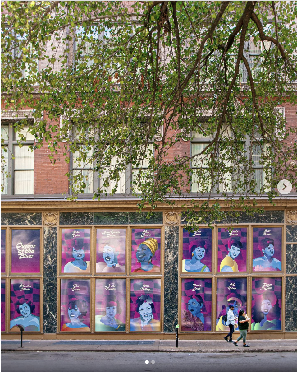
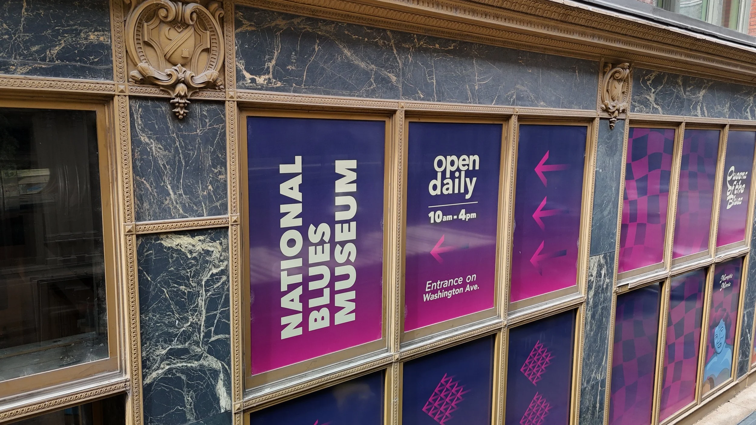
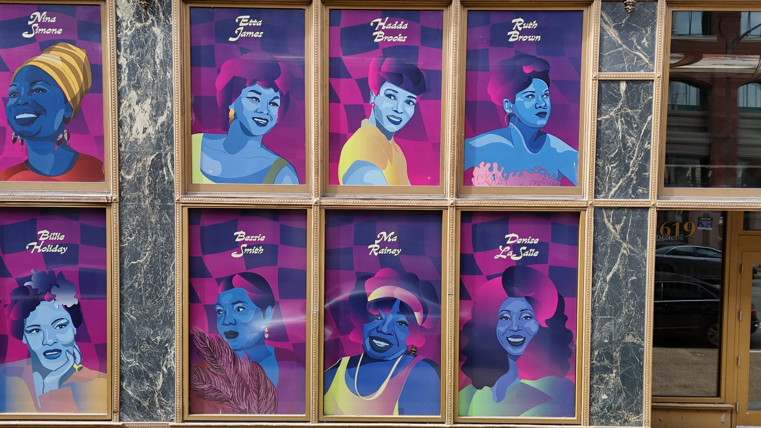
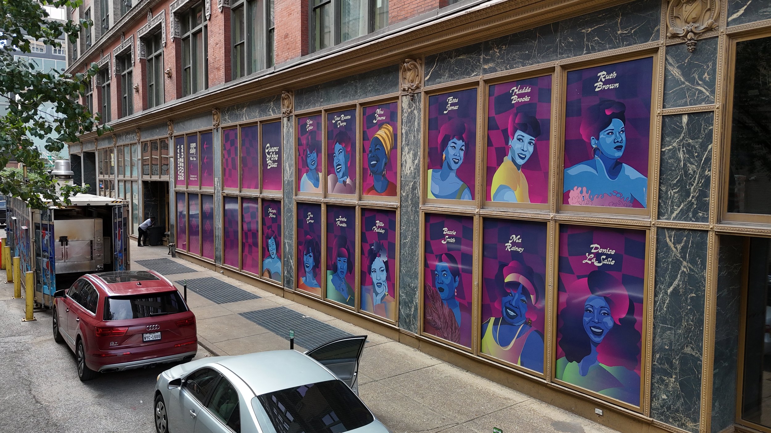
Queens of the Blues
In 2023, I created the “Queens of the Blues” mural at Washington Avenue and North Sixth Street, commissioned by the National Blues Museum. The project addressed the museum’s need to shield its private gallery from sunlight and outside visibility, while also elevating the exterior and serving as wayfinding toward the main entrance. I hand-selected and illustrated thirteen influential women of the blues, honoring their legacy and bringing their impact into public view.
The INFINITE Loop
In 2022, I was a featured artist in the Walls Off Washington mural program with “The INFINITE Loop,” commissioned by the Kranzberg Arts Foundation. Created with acrylic paint and 3M vinyl, the mural invites pause and reflection—offering a moment of stillness within the movement of the city.


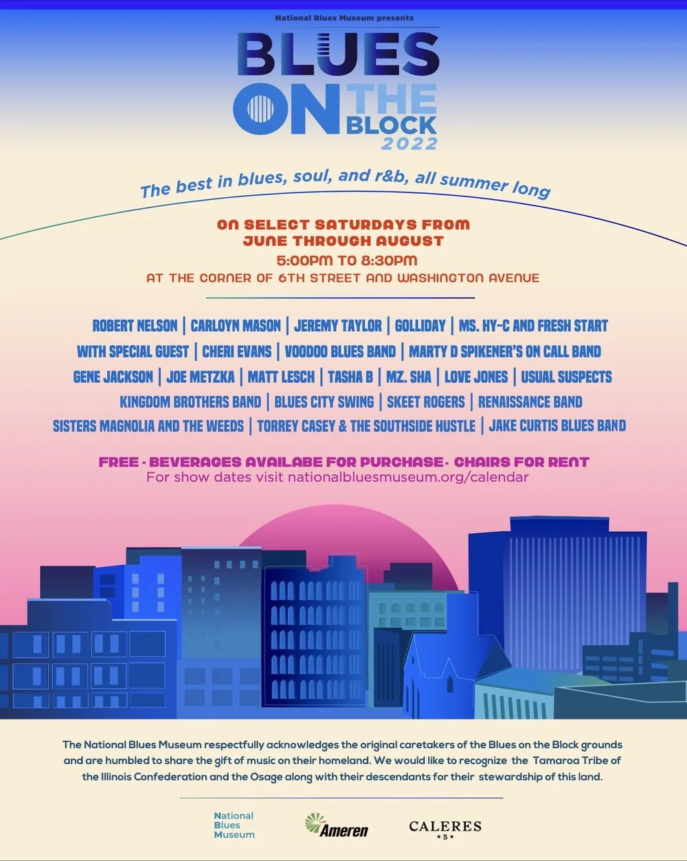
Blues on the Block
In 2022, I created the “Blues on the Block” mural at Washington Avenue and North Seventh Street, commissioned by the National Blues Museum. Serving as the backdrop for the museum’s summer street festival, the mural expanded on my original flyer design, transforming it into a large-scale celebration of blues culture.

To define is to limit
In 2019, I created the “Alan Watts Mural” for FlowState STL, a new gym seeking a bold centerpiece featuring Watts’ words, “To define is to limit.” Painted in acrylic and spray paint at 15 by 12 feet, the mural anchors the central room, visible from the street and upon entry, designed to be both dynamic and reflective.

